All About Exit Pages and Exit Rates and 8 Simple and Proven Ways to Decrease It
Exit pages are designed to keep people on your site longer, thus increasing their chances of converting. They also help you learn more about your users so you can improve exit pages and exit rates in the future. An exit page is a landing page displayed after someone leaves your site without converting or buying anything.
It’s usually an extra step before checkout or other conversion goals. Still, it can be used for any purpose where you want to encourage visitors who have left your website to come back and complete whatever action was next in their purchase process. In this article, we discuss exit rates and how you can decrease them.
High Exit Rates: Should You be Worried?
A high exit rate is bad for your website since it means that visitors aren’t sticking around long enough to convert. You can use exit pages for any purpose, but they are frequently used in eCommerce and other conversion-driven businesses where the goal is to get people from your website into a shopping cart or purchase confirmation page.
However, it doesn’t mean that a high exit rate for a page is always alarming. If you have a page with valuable content, it’s normal for visitors to leave without completing what they came there to do.
For example, suppose someone is looking at your product but needs more information before making the purchase decision. In that case, an exit might be completely natural and not necessarily mean you are losing potential customers.
Instead of tracking exits as something negative in this case, think about ways to use them to improve the conversion rate on other pages by offering self-explanatory insights into your product or service through pop-ups or tooltips.
It just means that people viewed your website but didn’t buy anything yet; no indication whether users found value on the landing page or abandoned it during the process of converting (leaving).
Another obvious reason a page has a high exit rate is that it is designed to be an exit page.
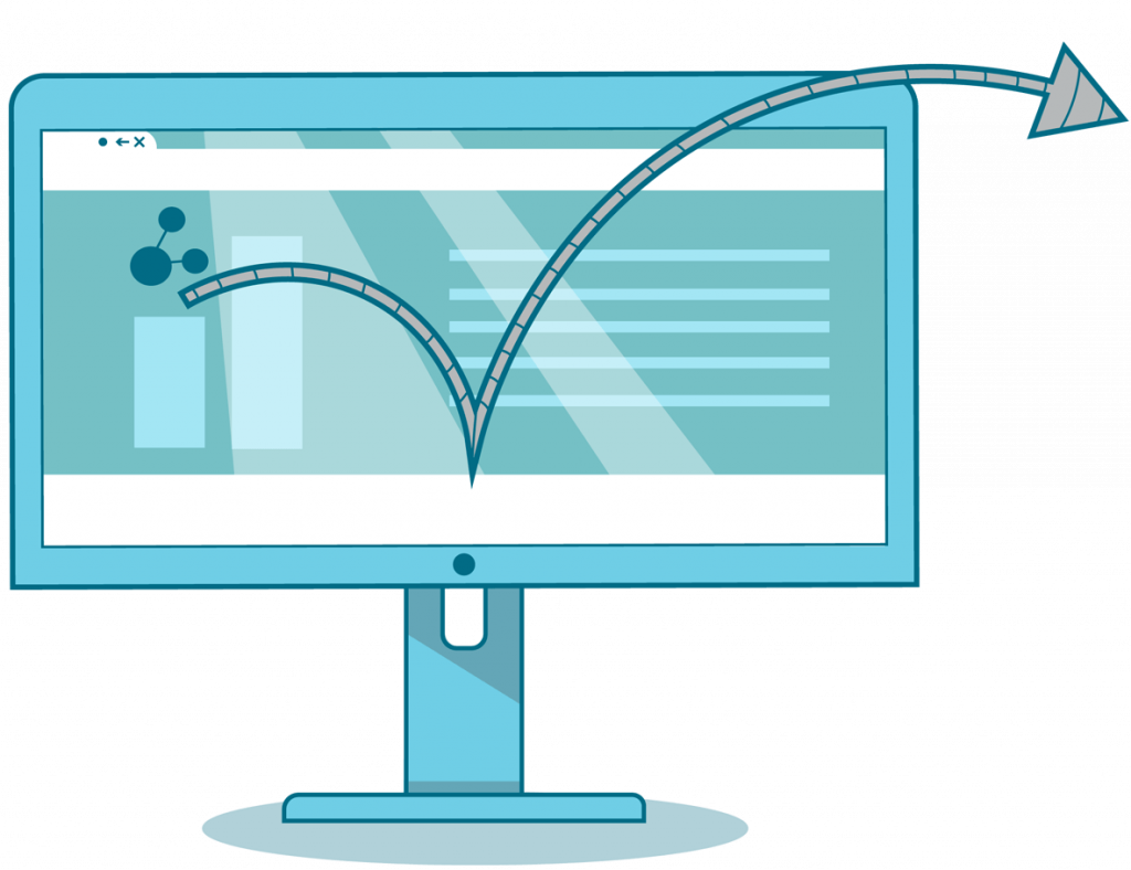
Best Practices to Optimize Exit Pages and Exit Rates
Use Marketing Automation Tools
One way of decreasing your exit rate is by using marketing automation tools such as Hubspot CRM. The tool allows you to create personalized campaigns based on user behavior so you can send emails encouraging them to come back and complete whatever action was next in their purchase process.
An example could be: “Hi John Smith! It looks like you left our site before completing your order today — we hope this $50 off coupon gets you back!”
Have a Consistent Branding
The exit page should also be designed to match your other pages and brand. It’s a good idea to keep the design consistent so visitors know they are still on your site rather than being tricked into going somewhere else — especially if you use exit links in paid advertising campaigns.
However, it’s unnecessary for all of your website copy or CTAs to appear on an exit page since their purpose is simply a last-ditch effort at conversion before someone leaves without completing any action with you.
Add Internal Links in Pages with High Exit Rates
Improving your exit rates requires a combination of both technical and human effort. While you can manually add a link to your exit page at the top or bottom of every web page, this is not an effective long-term solution since ongoing maintenance requires too much time and money.
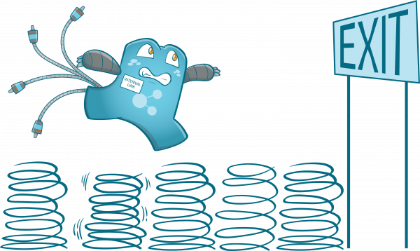
You also need to focus on creating better content to keep visitors engaged longer rather than just sending them away immediately after they land on your site. When they click an internal link, the exit rate of the page they were on will get lower.
Improve User Experience (UX)
Improving your site’s user experience can also enhance your exit rates. You can do this by removing clutter, using less text, and making it easier for your users to find their way around. Here are other practices that you can do to improve the user experience:
- Put important content above the fold
- Use large fonts
- Provide informative headings
- Keep sentences short & relevant
- Make things clickable if they’re links (versus lots of text)
When you provide a good experience on all pages leading up to an exit page instead of just one or two pages before leaving, then your user may be more likely to subscribe at the end instead of exiting from frustration.
In terms of exit rate optimization, though, frequently checking why people are leaving will help you better understand how to improve your site’s experience.
Using Exit Intent Pop-Ups
Adding exit intent pop-ups is also an excellent way to reduce exit rates. Visitors will be more likely to convert if they’re not distracted by other content on the page. And, exit pop-ups are an excellent way of doing that.
There is one drawback with using exit intent pop-ups or any type of pop-up for that matter. It can annoy visitors leading them to leave your site immediately without even reading what you have written!
That’s why you need to make sure yours aren’t too intrusive but do provide enough value, so people don’t mind being interrupted momentarily. Remember, your goal should always be improving conversions no matter how small those improvements may seem initially.
Use Sticky Widgets
Using a sticky widget in the sidebar can engage your users more if they click on it, and there is another page with more information about what you offer them. By doing so, your exit rate will be reduced because users won’t just leave after clicking on a link, thinking that’s all you have to offer them.
However, you shouldn’t just place a simple sticky widget. You need to make sure that the information in it is helpful to your users.
Optimize Page Loading Speeds
It has been proven that slow-loading pages affect exit pages and exit rates. If your pages take time to load, there is a chance that your visitor will leave even before the page has finished loading. If this happens too often, then most, if not all of your pages will have an increased exit rate.
There are a few ways to create a faster loading page. For example, reducing the size of images or using compressed image formats such as JPG and PNG instead of TIFF. You should also minimize requests from CSS scripts by using one style sheet for all pages on your website rather than multiple files that may reference each other. Consider moving these styles into an external file. So they load only once per session rather than every time someone visits a new page.

Create an Excellent Internal Linking Strategy
Your internal linking strategy also plays a huge role in improving exit pages and exit rates. As you are writing your blog posts, think about what links could be added to other relevant articles. If someone was reading an article on how to increase user retention using the app push notifications. Then they clicked a link that sent them off of your website forever, it would not reflect well on either party.
There is no need to put in a bunch of links. But it would be nice if the reader could click on something and go somewhere else that may help them out.
Using internal links on pages with high exit rates should be a part of your internal linking strategy since internal links act as suggestions for your guests. Plus, it is a good way to drive traffic from one page to another.
Before you go any further it would be a good idea to outline which pages have high exit rates. Then brainstorm some ideas on what links could be added that will not distract the reader but actually help them out. If your blog is about how companies can use technology for sales. There should definitely be more internal linking with other relevant articles such as social media marketing and website content.
A good way to keep your visitors engaged and get them from one page to another while also increasing user retention. When it comes down to it, you have two goals when writing blog posts; engage visitors and increase user retention which exit pages do not accomplish well at all.
Never Lose Organic Traffic Again through Internal Links
Now that we have gone over what exit pages and exit rates are in this post. I hope you learned how they can be harmful to both the reader and yourself as a blogger/website owner. Because of lost traffic opportunities when someone clicks on an external link instead of staying on your site or clicking something else available such as social media links or ads. Moreover, try adding internal links where appropriate. Readers can easily go somewhere else if needed but still, stay on your site.
With internal links, you can direct users to other relevant pages. This is to lower exit rates until they reach a designated exit page. Visit internal Link Juicer today to view our internal link managing tool and see if its features fit your needs.
